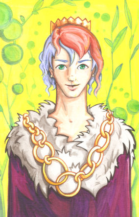
You have just finished drawing and painting your masterpiece and now you merely need to scan it so that you can share the results of your talent and inspiration with the whole universe. However, after you scan your art, you obtain something similar with the below image. The colors look faint and in no way replicate the intensity of the pencil strokes you see on the paper. What happened?
Too much light was used to scan this image
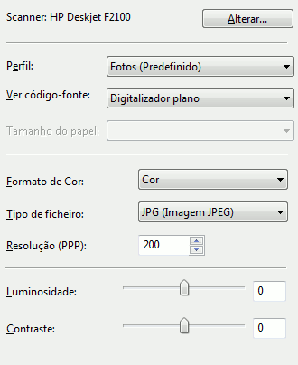
You need no magic to solve this problem. The first thing you might try is to rescan your art adjusting the light intensity of the scanner to a lower value. As in many other situations in life, less is frequently more. The interface to decrease the light intensity may vary from scanner to scanner, but it probably looks somewhat like the following image.
Scanner interface
After you rescan your art you obtain a less whitish image where the colors remain more visible, kind of like the image below. Better, perhaps, but still far from the colors you can see in your original drawing.
Image scanned with less light
To obtain more intense colors you need the help of an image editor, as for example Gimp. You can use other more glamorous software, such as PhotoShop, but Gimp serves a similar purpose and, furthermore, it's free.
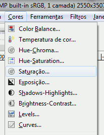
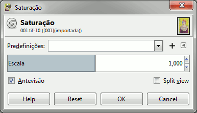
Open the scanned image in your image editor and increase the saturation. In Gimp click the menu "Colors" and then "Saturation".
"Colors" menu and the option to change the "Saturation"
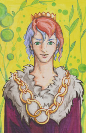
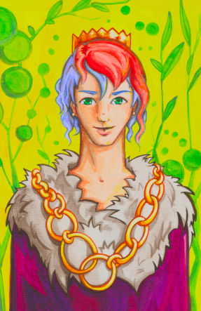
Afterwards, increase the saturation until the colors are more to your taste. Some images need maximum saturation, others just a slight increase. After you do this, your image will be looking better, as you see by the prince below.
Image with more saturated colors
However, you can still do better by adjusting the brightness and contrast, by accessing the menu "Colors" and then the option "Brightness-Contrast". Try changing these two options to improve your image. For this particular image I increased the contrast and slightly decreased the luminosity.
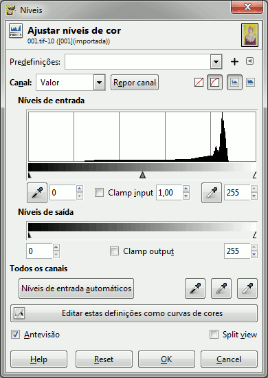
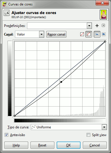
There are many other options in the "Colors" menus that you can work with to further improve your image. For this prince I clicked the "Exposition" and slightly increased the "Black level". You can try tinkering with the "Color temperature" or with the "Levels". There is an interface in Gimp that allows you to change the levels by pressing the button "Edit these settings as curves". Check the image below to see what buttons I pressed.
Interface to change the levels of the image
All in all, there is no set recipe that works ideally for all images. It's a matter of trying and checking what works best for your personal taste.
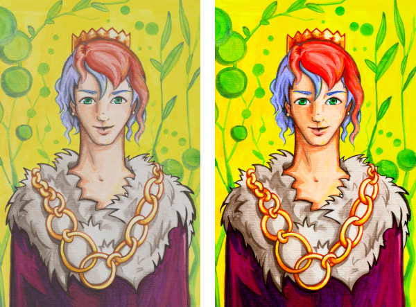
After all these adjustments, my prince is ready for the court ball. In the scanned image on the left he looks kind of pale. However, after Gimp's cosmetic he looks glorious and ready to break hearts.
Original and final image
This technique has given me results I'm happy with. Do you know other techniques or tips and tricks? Share them!
Happy drawing!
Ghost Alfredo is forgetful and needs your help to remember.
Indicate whether the phrases below are true or false.
True
False
After scanning an image the colors are always perfect
True
False
It's possible to change the image saturation
True
False
It's possible to change the image's color temperature
 Go to the Library